Children's Dentistry
Role: UI/UX Designer | Client: Lead Developer

This pediatric dental site, originally built in 2008, had outdated visual design, poor responsiveness, inconsistent navigation, and excessive use of clashing colors. I led a complete redesign to modernize the user experience while preserving some of the site's original charm. The new layout is responsive, accessible, and easier to navigate for parents and guardians.
Initial Issues
The site had not been meaningfully updated since its creation in 2008. It suffered from accessibility issues including poor color contrast, unstructured text blocks, and layout problems on mobile devices. Many pages contained redundant or repeated navigation elements and there was little hierarchy to guide the user. The use of animal-themed visuals was playful but visually overpowering.
- Visual style inconsistent and cluttered
- Poor mobile responsiveness and no layout scaling
- Navigation with repeated or unclear link structures
- Lack of accessible font and contrast settings
- Animal imagery distracting rather than supportive
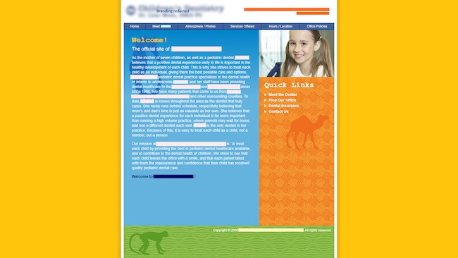
Legacy homepage layout with excessive color and weak hierarchy
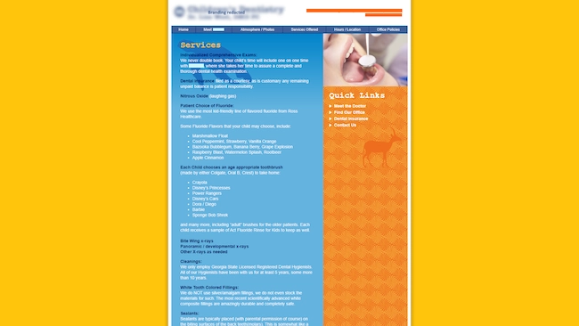
Outdated services section with redundant links
Design Goals
The redesign focused on simplifying the structure, improving readability, and retaining visual personality in a more subtle usable way. I created a consistent color palette based on accessible standards, cleaned up navigation flows, and restructured the content to work fluidly across devices. Subtle background animal patterns were retained to reflect the site's original identity without overwhelming users.
- Structured and accessible layout across screen sizes
- Reduced color palette for readability and visual coherence
- Preserved thematic animal imagery in a toned down background role
- Improved content structure and semantic HTML
- Focused on ease of use for non technical users such as parents and guardians
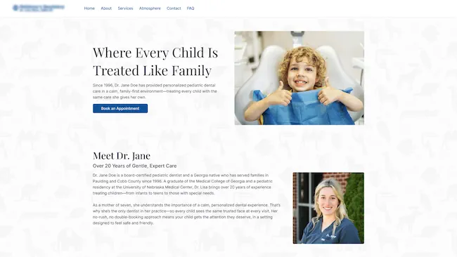
Redesigned homepage with clear hierarchy and simplified layout
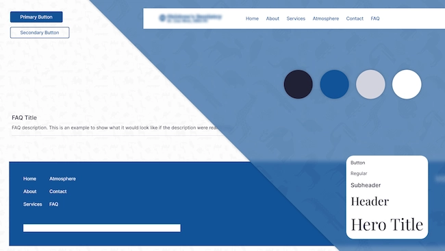
Design system with updated type colors and spacing rules
Homepage Redesign
 Before
 After
AfterServices Page Redesign
 Before
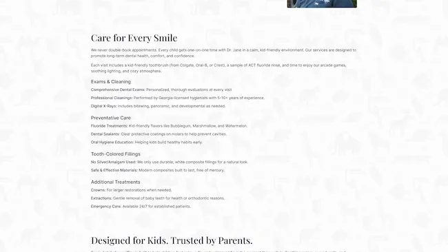 After
AfterGallery

Redesigned homepage
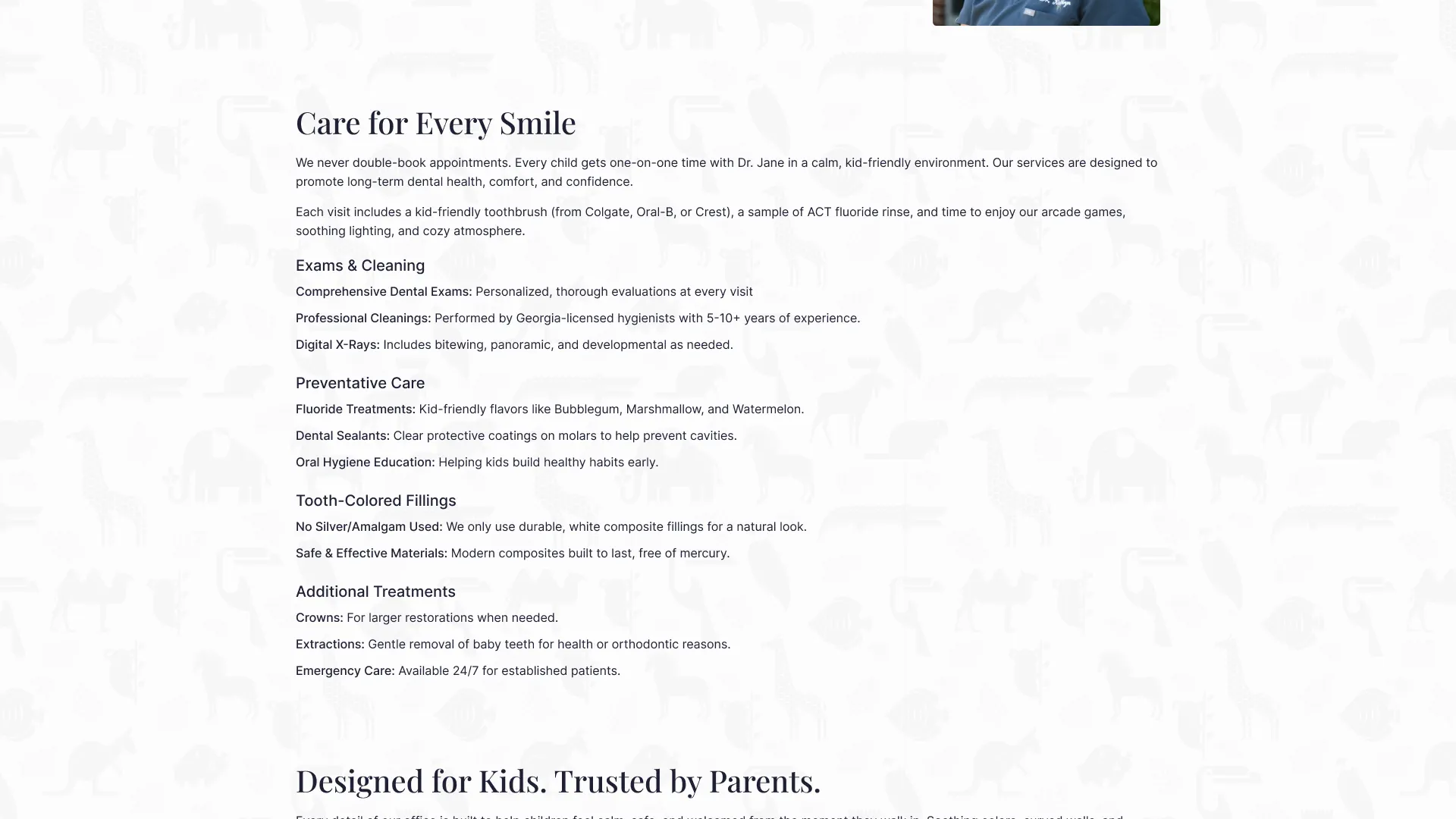
Modernized services page
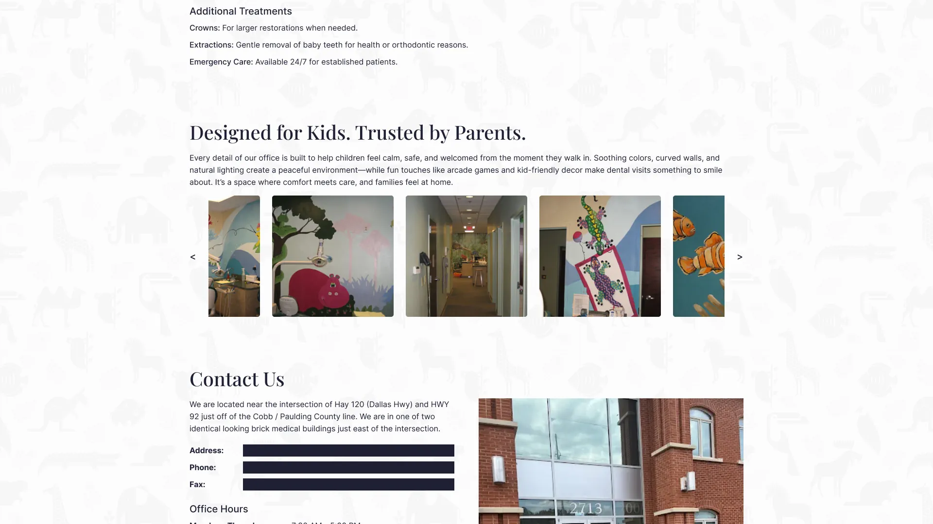
Improved image layout and page flow for atmosphere section
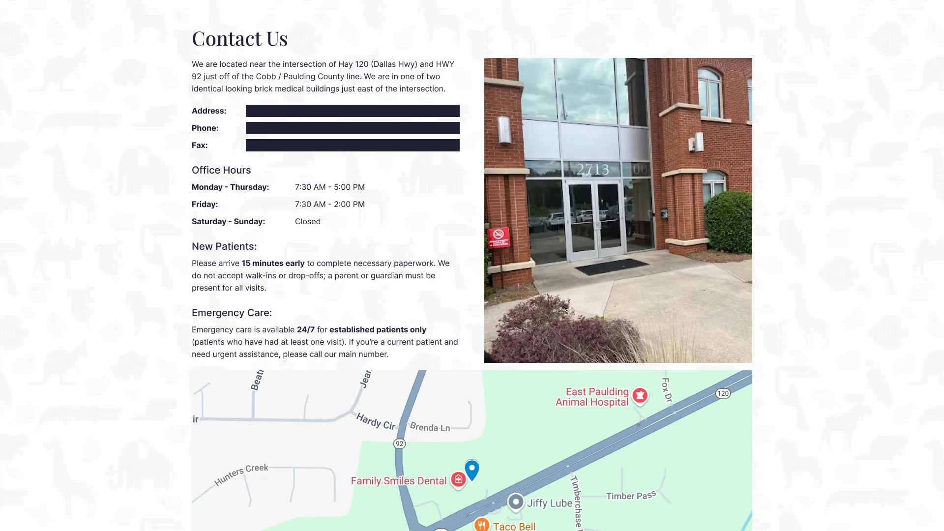
Contact page with improved accessibility and form structure
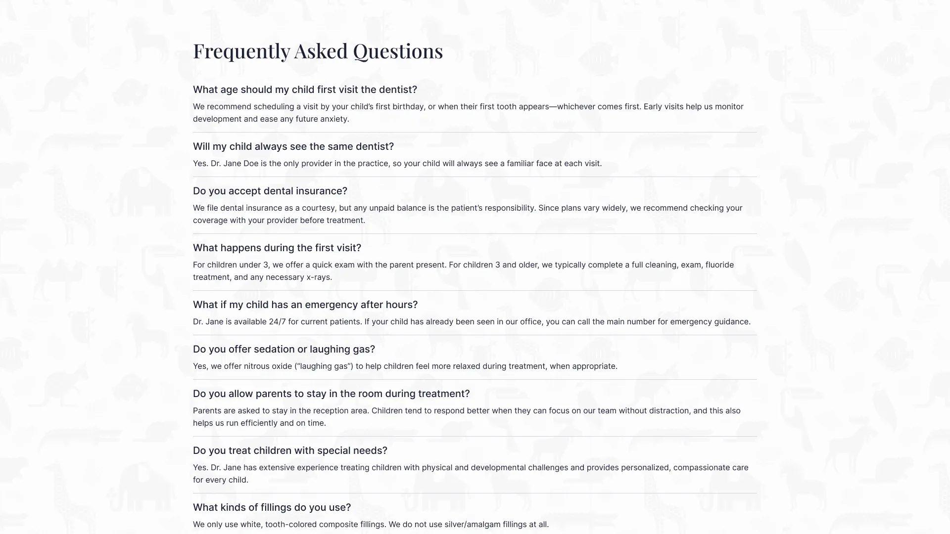
FAQ layout with readable content blocks and refined spacing