Regional Waste Services
Role: UI/UX Designer | Client: Lead Developer
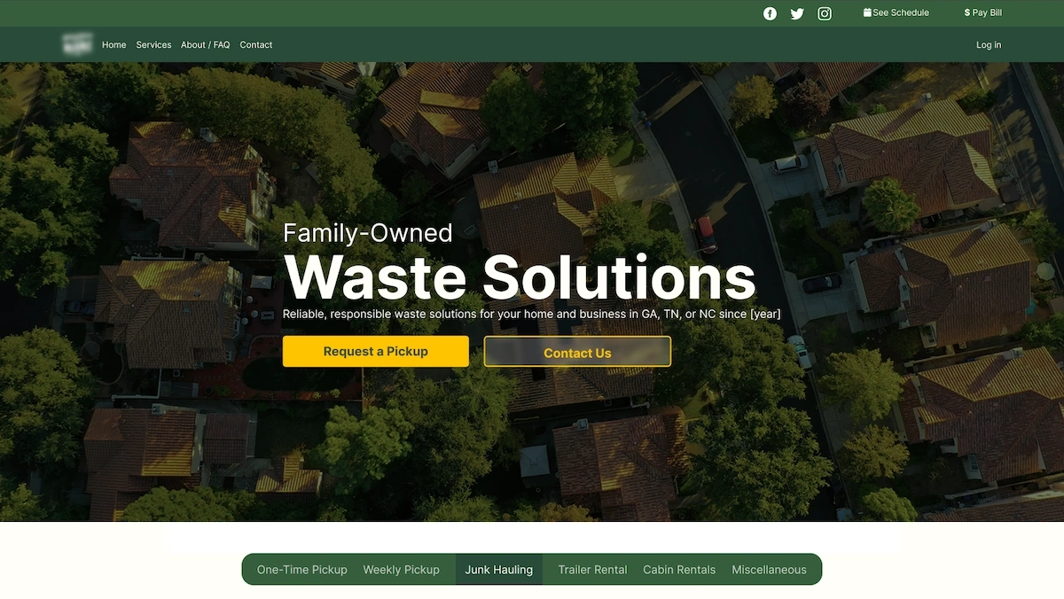
This local waste service provider website was originally built using an outdated WordPress template with inconsistent styling, poor contrast, broken navigation, and cluttered, low-quality images. I led a full redesign to improve accessibility, modernize the interface, and create a cleaner, more understandable experience across desktop, tablet, and mobile.
Initial Issues
The original site was built on an outdated WordPress theme with inconsistent design patterns, broken links, and low-resolution images reused excessively. Navigation was unclear, with many dead-end pages and overlapping options. Core actions like checking service status or reaching support were hard to find. The visual hierarchy was weak, and the dashboard was overloaded with unnecessary options.
- Outdated WordPress template with hardcoded styling
- Broken or circular navigation flows
- Low-contrast text and weak visual hierarchy
- Pixelated and repetitive images
- Overloaded dashboard with nonessential controls
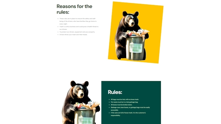
Legacy interface with unclear contrast and layout
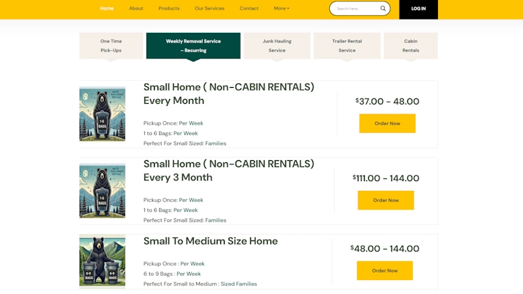
Homepage cluttered with repeated service tiles
Design Goals
I focused on creating a cleaner, more intuitive layout with better spacing, clearer navigation, and modern visual styles. The design system was structured in Figma to support consistent typography, spacing, and button behavior. I updated image assets to be higher quality and ensured layout breakpoints worked across screen sizes. I also improved contrast and semantic HTML to move closer to accessibility best practices.
- Cleaned up visual hierarchy and spacing
- Structured reusable components in Figma
- Improved navigation clarity and layout consistency
- Replaced low-res assets with optimized image content
- Improved contrast and markup for better accessibility
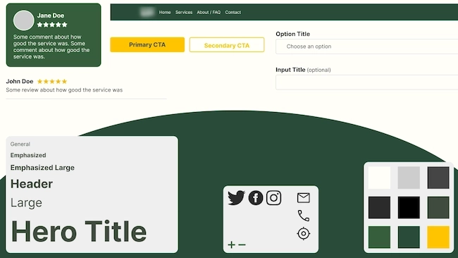
Style guide – typography, color, and layout tokens
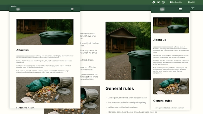
Responsive layout structure across screen sizes
Homepage Redesign
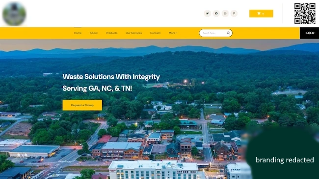 Before
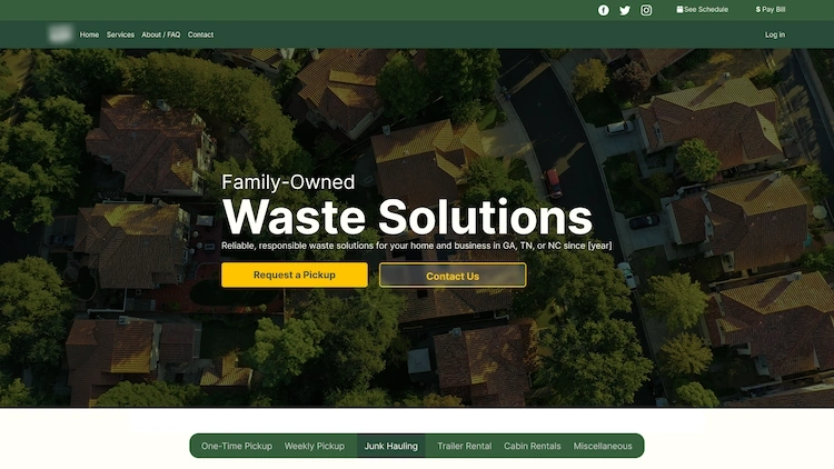 After
AfterLogin Redesign
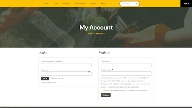 Before
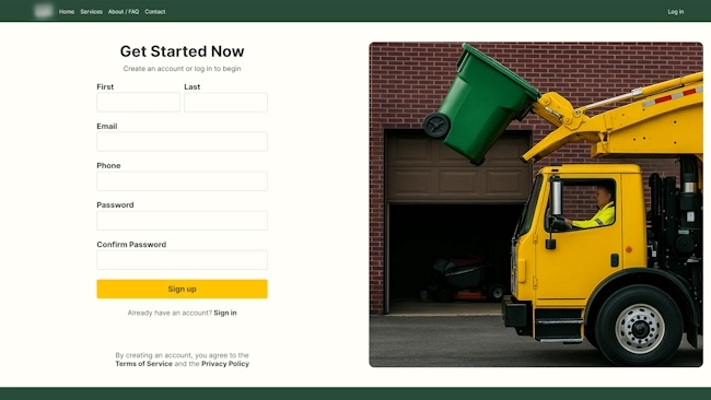 After
AfterGallery
![Final homepage – desktop [Branding redacted]](/projects/atbg/rhomepage.webp)
Final homepage – desktop [Branding redacted]
![Redesigned service dashboard – desktop [Branding and names redacted]](/projects/atbg/new-dashboard-desktop.webp)
Redesigned service dashboard – desktop [Branding and names redacted]
![Contact form layout with improved accessibility [Branding and names redacted]](/projects/atbg/new-contact-desktop.webp)
Contact form layout with improved accessibility [Branding and names redacted]
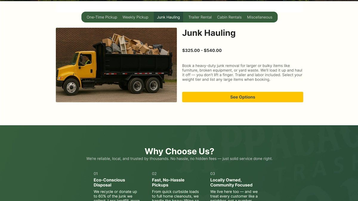
Pricing and service tiers layout
![Redesigned product page [Branding redacted]](/projects/atbg/new-product-page-desktop.webp)
Redesigned product page [Branding redacted]